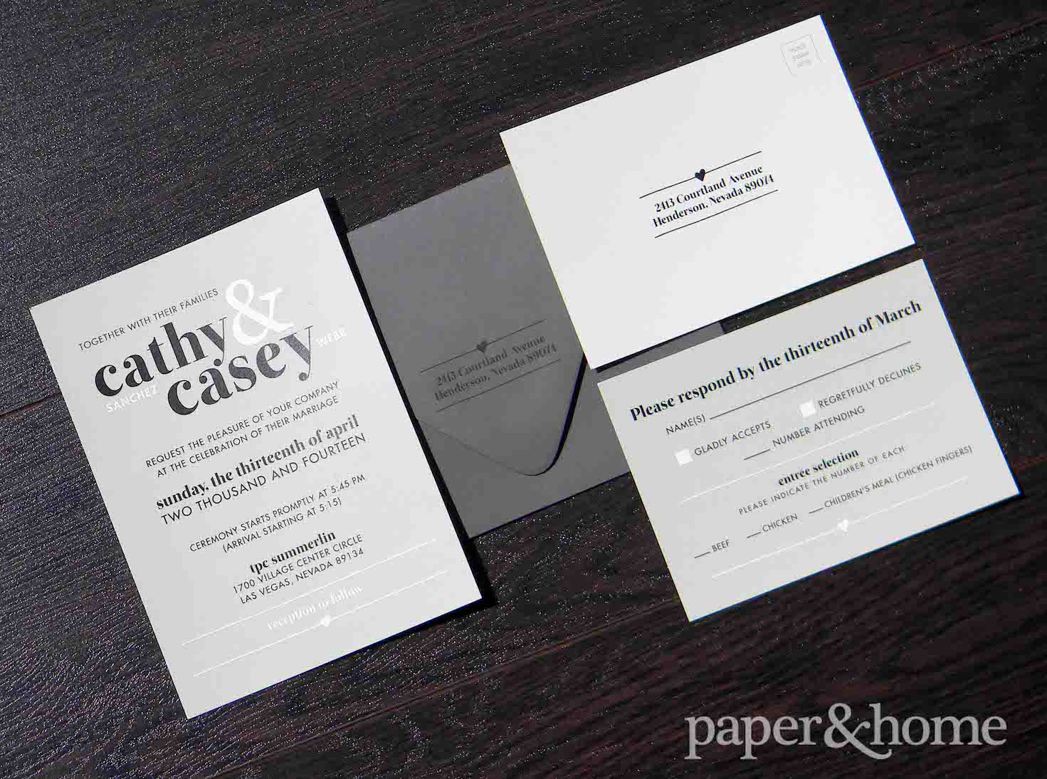

Cathy and Casey are such a cute couple. Meeting with them was a joy. They were on the quiet side, but they knew exactly what they wanted: modern wedding stationery.
What they were after was a type-driven design. They chose a neutral color palette of gray, black, and white. This was a perfect choice for the fonts and layout they desired. We added a pop of cuteness with a little heart on the invitation, reply postcard, and envelope.
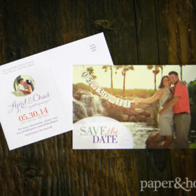
The design began with this save the date. Cathy and Casey provided us with a few photos from their Red Rock engagement session. We presented them with several options, as we do for all of our couture clients. They chose this excellent design with a circle crop around their cute portrait. We introduced the fonts and layout of their choice at this phase. They were then utilized in their other pieces, completing their modern wedding stationery set.
The couple was married this past spring at TPC Summerlin.

