
Heidi knew just what she wanted. Her style is simple, and we mean that in the highest regard. She was seeking classic wedding invitations and easily gravitated to designs she loved.
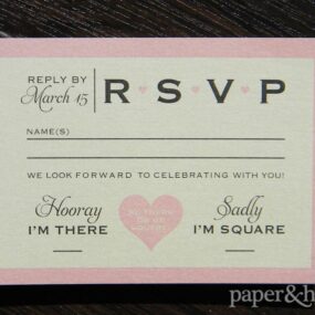
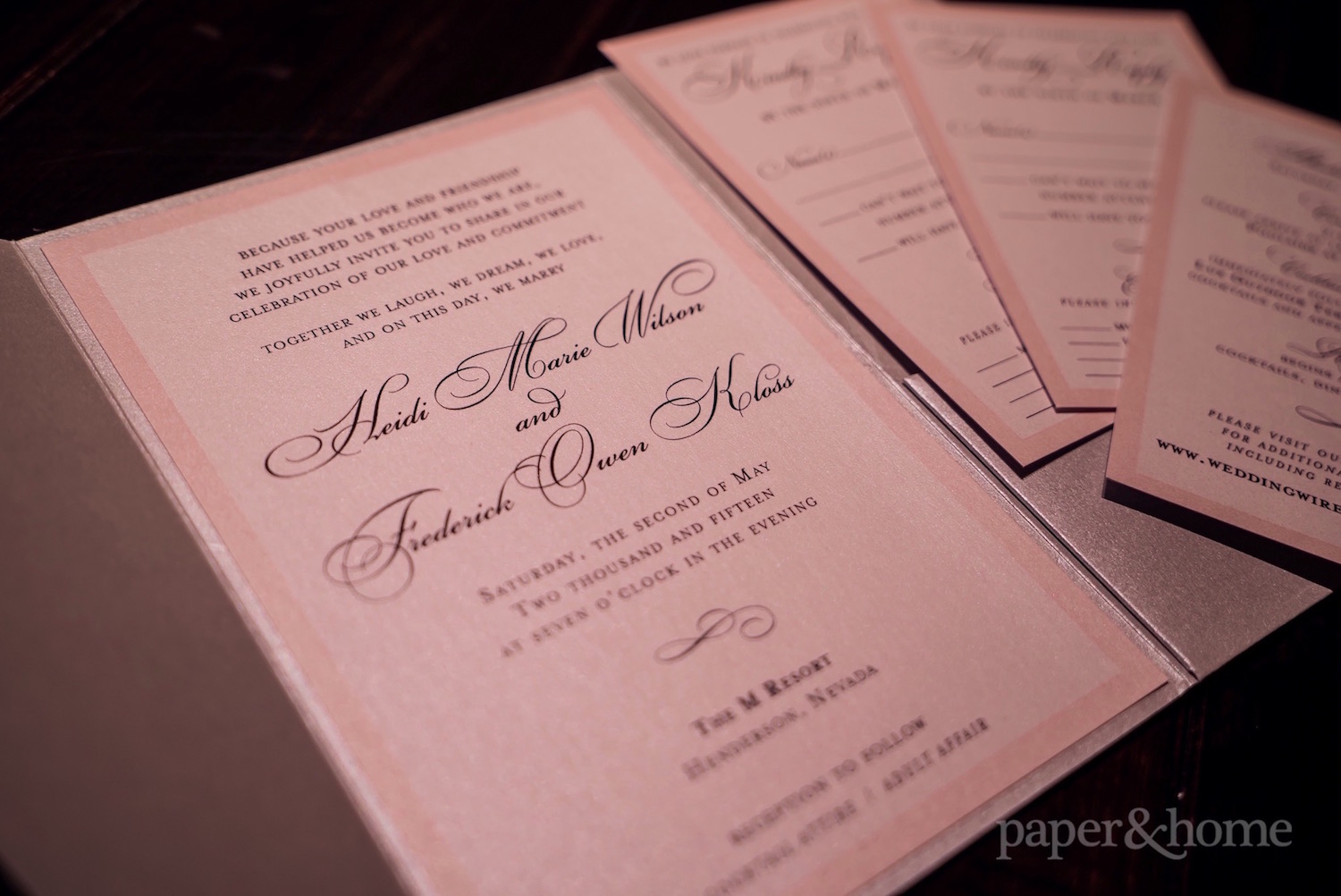
We mixed a few design elements from our collection. The invitation card starts with an all-caps serif font leading into a classic script font. A simple flourish separates the information on the card and a soft pink border completes the design. When working with simple elements, everything must be perfect. The balance is just right in this design and Heidi loved it! Her coordinating reply postcard and information card mirror the invitation.

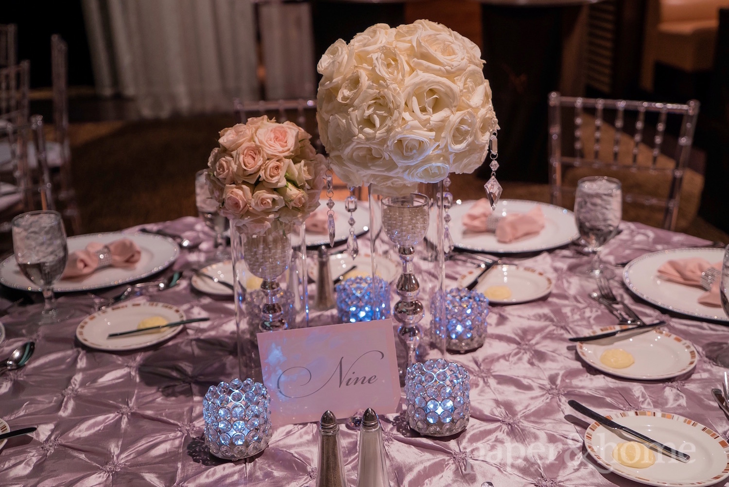
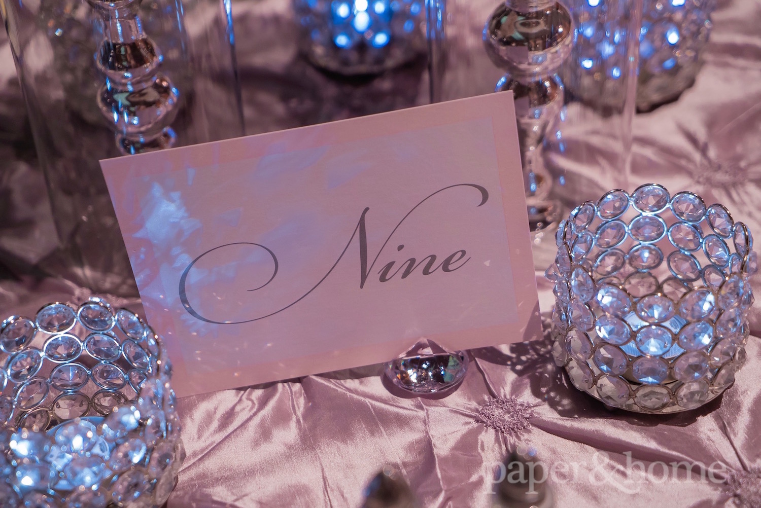
At the wedding, Heidi chose a few stationery accessories to compliment her decor. First up is her classic table numbers, with the number written out in an easy-to-read cursive. The font choice was deliberate so guests could easily read their table numbers from a distance.
How clever is this escort card table sign? It lets the guests know that this was going to be a party. No wallflowers wanted here. Heidi and Frederick encouraged their guests to dance!
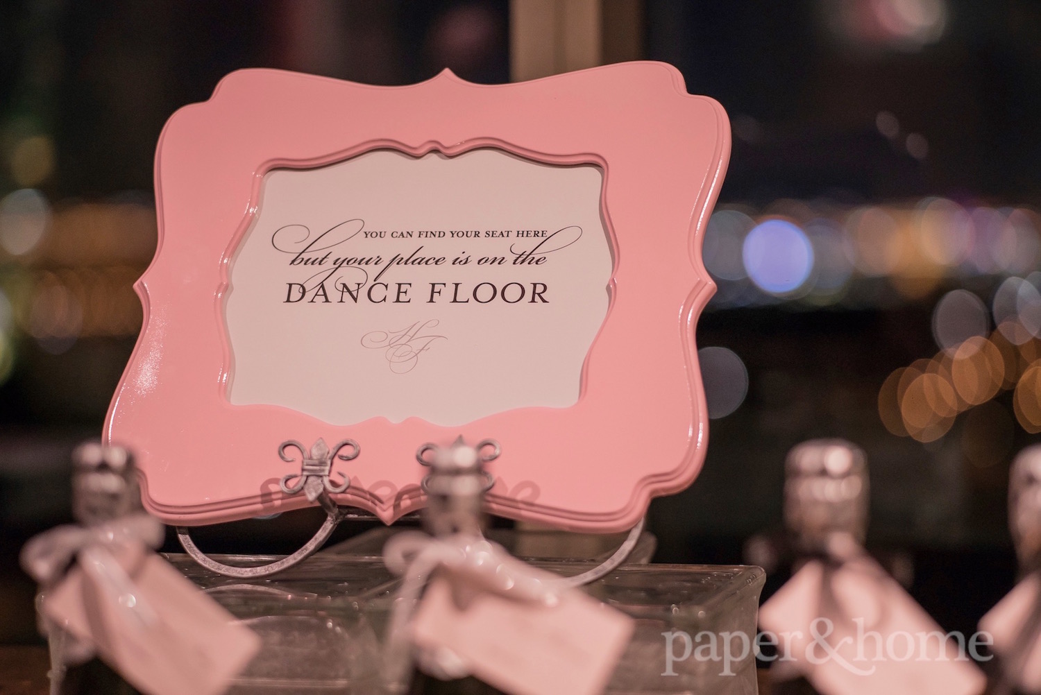
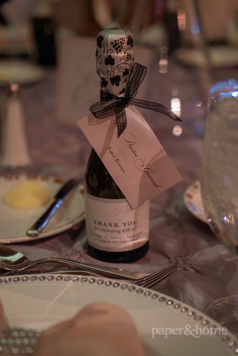
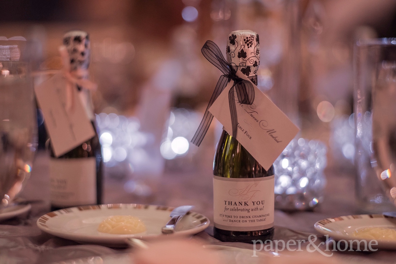
In case the sign wasn’t enough encouragement, Heidi and Frederick drove the message home with their escort cards! These awesome escort cards doubled as a wedding favor for their guests. As the champagne bottle suggests, Heidi and Frederick wanted their guests to party! Sure, polite dinner conversation is nice, but drinking champagne and dancing on the table is way better! This time, we flooded the shimmer escort card in pink to create contrast. The custom champagne bottle label featured a silver border and the same font treatment for a cohesive look. The monogram added a special touch. Super cute idea!
These classic wedding invitations and accessories prove that elegant can be fun! Thank you Ella Gagiano Photography for the images!

